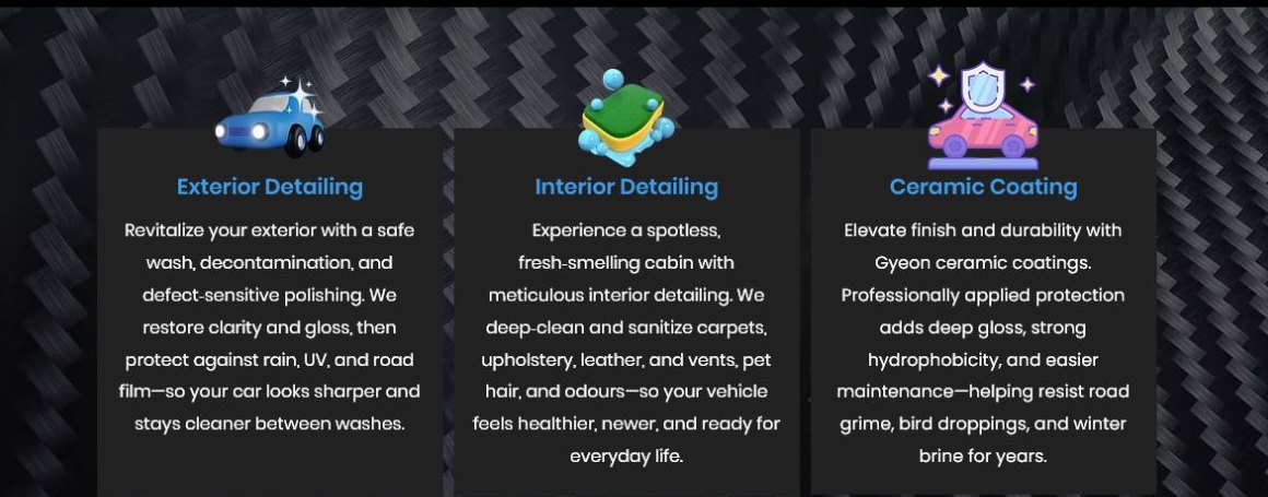
Before
Services were present, but harder to scan.
Selected studies
Proposed redesign studies showing how service-business websites can become clearer, easier to scan, and easier to act on.
Not every study here is a live client project. Some are proposed directions included to show the design and structure decisions behind the work.
Local mobile service business
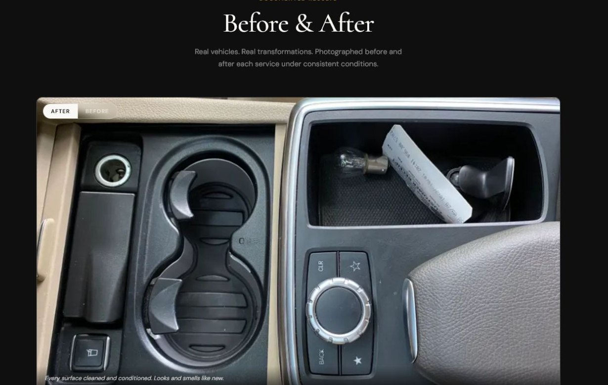
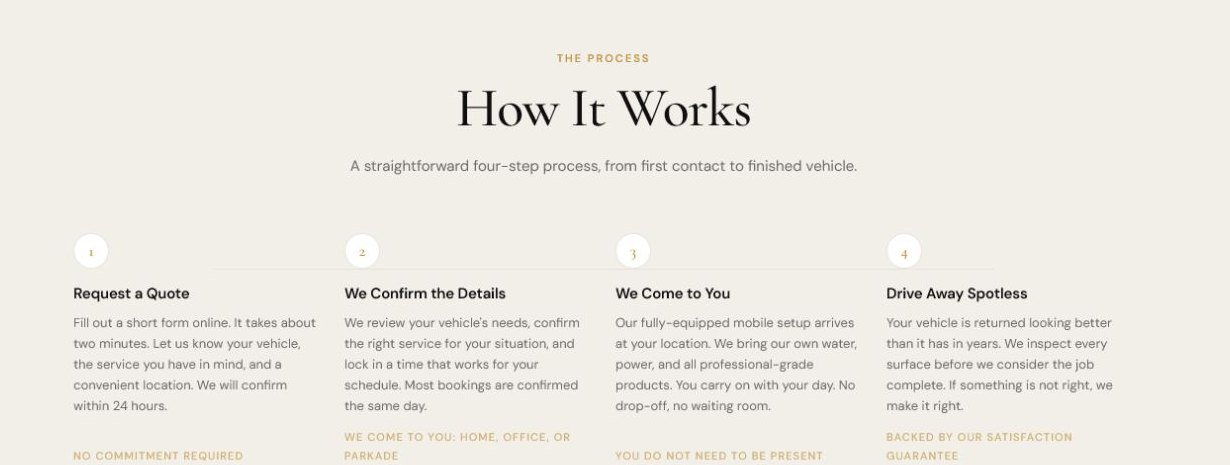
A structure study comparing an existing services section with proposed service, proof, and process sections. The company name and contact details are intentionally omitted.
Services were present, but harder to scan.
Services were grouped into clearer decision points.
Visitors need to understand the offer and path to quote quickly.

Pattern notes
Is the offer clear in the first few seconds?
Are services grouped in a way normal customers understand?
Is the contact path visible without feeling pushy?
Does the page build trust before asking for action?
Next step
I can look at the first screen, service order, trust signals, and contact path, then suggest a clearer structure.
Start here
Send me your site. I'll take a look and tell you, honestly, what I'd fix first.
Start a conversation